Monday, December 9, 2013

Moodboard

The images selected here on the mood board illustrate a variety of moods and demonstrate the feel that I want to achieve in my product packaging and advertising.
I particularly like the slightly blurry and impressionistic feel of the flower image and the girls in the rain.
The images can be interpreted to reflect both happy and sad moods and have a dreamlike quality.

Sunday, December 8, 2013

Font Choices

Here are the fonts being used for the front, back, inside, CD and DVD of the digipak and magazine advert, and it will be explained why they were selected to be part of the composition:


Inside digipak, back

This has mainly been used across the front and back of the digipak, featured in headings of the band's name and to list the contents and titles, where the representation is intended to give a professional appearance, as the font appears modern.


"MoonFlowerBold"

Back, mag,

Used twice, once to give credit to the artists on the back and as the main font in the magazine advert, it's stylised and bold that means depending on the colour that's used, it can transmit any message.

StaticBold


Back

Only used once, for the copyright information on the back cover, it's not a particularly unique font but can be thought of as mixing MoonFlowerBold with a more standard font, therefore being useful as a back-up font, which was it's purpose.
"StaticBold" is a superb choice as it's different from the other fonts, in that it looks similar but there's something about the aesthetic that, from my point of view, makes it ideal to highlight certain information. The information that it's intended to be used for is likely technical.

FromStreetArt


The expressiveness this font gives makes it a natural choice for introducing the ideology of the digipak, as it's also a font that can transmit a range of feelings through it's mode of address, just by adjusting the colour. As a result it's been used for the titles on the front as well as back covers, tracks/video titles on the back, CD and DVD and in a screenshot of the front cover in the magazine advert. Within each text the feelings vary as the subject matter is different, but the ideology remains the same.

Monday, December 2, 2013

Codes and conventions of music videos

The main codes and conventions for a music video are:

Codes:


  • Camera shots - Usually there's a mixture of long shots, close ups and extreme close-ups to place emphasis on the musicians and to ensure lip-synching is intact especially with extreme close ups on the lips.
  • Movement - Whip pans, tracking shots that move at a pace on a dolly and crane shots keep the performers in the frame, along with vertical tilts and horizontal pans so there's enough variation and coverage
  • Editing - Terms can range from jump cuts, to MTV or montage editing. Jump cuts symbolise the camera moving from performer to instrument to location and so forth without having any narrative continuity. MTV editing is where this moves at such a fast pace, it encourages repeatability to be able to catch up and montage editing follows the musicians as the video moves forward.
  • Effects - Once the sequences that have been filmed are put together, digital effects are added including split-screen, CGI, colorisation and lots more.
  • Lighting - This is one of the more important codes as it sets the atmosphere and mood for a music video. For instance if there's extreme high-key lighting, it can enhance the star image of a musician or if there's a change from colour to black-and-white, there can be a shift in the song.
  • Mise-en-scene - The components of props, costume, location, body language and others all combine to also set the tone of the music video, as well as informing the story. It can be that a video is set in the 70s, and the costumes are exaggerated to create something that's a parody, for example or by staying true to convention and having the location be a concert hall or studio.
Conventions:

  • Narrative - A series of events are unified within time and space and have the musician go on a journey or it follows their performance in a single location. To ensure repeatability generally the narrative is one of the components that has less focus, and is suggestive. 
  • Band performance - There has to be authenticity in the performance of the band and this is why there are often close-ups of lips to show lip-synching, instruments being played, chorus shots are repeated and there are specific shots and angles that gives a view of events including audience reaction.
  • Solo performance - Here conventions of a band performance are repeated, one of these being lots of extreme close-ups of lips. There can also be first-person views of the artist engaging the audience as this takes advantage of mode of address.
  • Star image - Whenever someone is promoted by a record company most artists don't receive as much fame. Therefore it's a case of them being marketed to suit the image of the record label, stars being manipulated in the process and is why audiences relate to the metanarrative in music videos, as their image is manipulated where it appeals to a particular target audience along with others.   

Tuesday, November 26, 2013

Final Idea for my music video

The final idea for creating a music video, is to take the lyrics of "Mr Brightside" by The Killers, and turn it into an original narrative, meaning the diegesis will change as there's no attempt to stay true to the original but take elements.

Speaking about story, this is about a young man, originally played by Harry Bowers but now by Peter because of scheduling conflicts who's in love with a girl played by Megan Wainwright where she cheats on him, and the mode of address is intended to play with the verisimilitude as it cross-cuts between the events and a song about this being performed in a studio.

Ellipsis will be focused around non-linear editing technique that's makes sense because of how the video is structured. Enigma code plays into the end as Peter is taken away by a couple of bodyguards at the end, hired by Megan after he becomes violent and it's not seen what happens.

Wednesday, November 20, 2013

Target Audience research - video questionnaire

As part of research into demographics, five people were asked to look at the video of "Mr Brightside", all in the age category of seventeen to eighteen, meaning they're close to the targeted age range and appropriate answers to the questions were given:


What are the most appealing elements of this video?

William Chong: Interesting concept and editing.

Harriet Bragg: The costumes.

Samantha Clarke: The editing and use of colours.

Least appealing elements?

Use of special effects.

Special effects.

Special effects.

What do you think about the use of stars such as Eric Roberts, who is sitting in the red chair at the beginning, does it offer more incentive?

Appealing to anyone who is into such stars, but I don't really think it makes much of a difference.

I don't know who Eric Roberts is, so I can't really comment on that.

This isn't needed for the music video, because not everyone that watches the video will know who he is.

Does the video make you want to show it to others?

I might show the song to others but maybe not the video. 

I would show it to somebody who I knew liked the style of the band/video.

No not really, this is because I don't alway watch the music video's, and it's not really a genre that I listen to.

Who would you assume is the general audience of this video? Consider age range, gender and socio-economic groups?

Early 20 year olds who like indie music.

Late teens to early 20's. 

20 - 35 year olds, and maybe a bit more for the boys than girls.

Do you think this is generally faithful to the style of The Killers, where their main genre is alternative rock that rejects convention and covers a variety of social themes?

Yes, they do it in quite an artistic way. 

Yes, it seems to cover those aspects in an interesting way.

Yes, they have use an artist style to achieve it.

How would you expect the video to be marketed, whether through social networking, magazine adverts and other avenues?

As it is quite an indie song, I suspect that the video would be used through social networking and other viral marketing. 

I think it would be marketed through visual advertising, e.g album advert on tv,or through social networking.

Viral marketing would suit both the genre, an their use of bright colours at it would catch people's attention before they skip it, so they will be more likely to watch it.

Have you seen the video before and if so how?

I have not no. 

No.

No.

These responses indicate what appeals to the target age range and are also analytical, especially in regard to gender consumption. To give an example one of the responses to the one of the questions of how the video would be expected to have marketing handled, because the response explained viral marketing would suit both genres, as would the use of bright colours in the video to help catch attention. This is from a female so it's proof as to how this video has inspired analytical responses from both genres.

Monday, November 18, 2013

Target Audience research - Reaching out to The Killers community

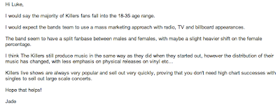
As part of research into the culture of the fanbase of The Killers, messages were posted on the official Facebook page, and sent to the Killer's manager and the forum administrator of the official Killer's website.

Jade Skellington is the forum administrator of the Killer's website and her response below gave me some good information on the Killer's fanbase.  


Saturday, November 16, 2013

Target Audience research - listening & downloading

Research Into Target Audience

Two online music databases have been selected where research will be conducted and what the connotations will be: Lastfm and MySpace. Lastfm is the world's largest online music database, information is downloaded or transferred and each time this happens, it's recorded as a scrobble. The Killers have over 175 million scrobbles, the information is shown below. Mr Brightside - which is the song I've chosen to adapt into a music video -  is shown as the Killer's most popular song.


The statistics below show the consistency of the loyalty of the fanbase over the past six months, as there has been no peaks or troughs and also shows consistency in how The Killers have been able to encode their messages well. There's also a selection of some of the top listeners and their listening trends although it's not representative of the fanbase overall, as despite being the most popular song Mr Brightside isn't mentioned amongst the trends.


MySpace is a social networking site, allowing licensed music to be streamed and artists to upload their own music, making the website more personal for musicians and is a highlight of how convergence has worked. The song "Mr Brightside" has been played over five million times and at the time of writing is the fifth most popular Killers song on Myspace.


The implications of what has been found is that Mr Brightside is a very popular song so as has been mentioned, it makes it a logical candidate for adapting into a music video. As The Killers have over 175 million scrobbles on Lastfm that's an indication music websites are a good source of promotion, in addition to The Killers having a superb prominence on MySpace.

Friday, November 15, 2013

Target Audience - questionnaire


To get some general views from my target audience I asked 15 respondents to answer the following questions:
General Questions
What is your age group:
16-25 □ 26-35 □ 36-45 □ 45-55 □
Are you male or female?

Genre Questions
What are your thoughts on Dance-Punk (for instance in the style of The Ting Tings and The Prodigy)?
What are your thoughts on New Wave (in the style of The Killers and The Police)?
When you hear of a band such as The Killers what do you expect music to be like?
Do you prefer music videos that are driven by the performance of the artist creativity story?
Do you think a story based around a relationship would fit a music video based on the genre of New Wave (in the style of bands including the Killers)?

Magazine Advert Questions
What would be your preference in a magazine advert for a band from the following choices:
Artistic shots □ Band Members □ Information on songs □ Clear contact information □ 
How many magazine adverts would you flick through before you get disinterested?

Listening Questions
How often do you buy music out of the following:
More than once a month □ Once a month □Twice a year □ Never
What’s your preferred method of purchasing music?
I don’t purchase music □ Downloading □ Buying CDs online □ Buying CDs from a shop
What’s the main appeal of downloading music?

Friday, November 8, 2013

Digipak Analysis - Night Visions by Imagine Dragons


There's a simple focus surrounding the front cover, as there's little in terms of content but the content that is there, is stunning, showing how the mise-en-scene has been thought of carefully in relation to composition. Part of the mise-en-scene is there's a purple overglow close to the top, giving the cover a bit of a techno display that goes within the attitudes and beliefs of alternative rock, especially as it hints at apocalypse and relationship themes. A wide shot shows the main figure staring into the distance, denoting that he's contemplating about life, but as Death Of The Author mentions, there's no single interpretation that can be given by the artist.

The figure is surrounded by what appears to be temple formations. These are possibly connoting deeper layers about apocalyptic themes, as the mode of address appears to be engaging audiences from a detached perspective. Imagine Dragon's logo stands out as the representation has an unusual slant, although it also appeals to the target demographic, being an audience that's younger than the age of thirty. This theory could prove to be correct as although the band haven't compromised the content of the lyrics, there's an appearance about the digipak that means the target demographic is inclined to be younger. Going back to the font of the band, the colour is white, potentially symbolising religion as in post-apocalyptic times, a form of salvation is having faith in God. Night Vision's heading fades in slightly, as the colour is still white but the decrease in size diminishes the heading to an extent.

Imagine Dragons are aiming at a modern audience, given their style presumably a younger crowd so the lower end of my age range might be in their range. The audience I'm going after is modern also; people who are up to date so modern themes are more likely to apply to this crowd, although perhaps not entirely in my age range. This is as the sixteen to twenty five range puts a limit in themes that can be explored.

A dark background stands out on the back, essentially being a signifier for how the subject matter's going to be portrayed, especially standing out with the font for the tracks as bold white. Codes and conventions are followed for back covers, as the tracks are listed and a web address is given as well as the record label, providing the necessary information for audiences to be able to research the band.  headings which is suitable because it functions as a symbol for the subject matter that will be covered in this album. In keeping with the codes and conventions of albums, the tracks are listed using the same font as the subheading on the front, keeping with tradition as bands usually keep the same style or colour in some form across the album.

Referencing the inside panels of the digipak, it relates to the front cover through the use of cloud imagery, which conforms to conventions of there being a continuation of style, along with using the same diegesis. The inside panel doesn't exactly reflect the mise-en-scene of the front however, as although it uses the same lighting, positioning and other conventions, there are no temples or main figure shown.

Moving onto the CD, no information is listed apart from the band and album titles. There are lots of tiny circles, potentially symbolising an endless void and this is the iconography Imagine Dragons are attempting to represent. Copyright information is also commonly spread around the circle as the CD is the main content so audiences can know who the rights belong to, as well as other information. The font for "Imagine Dragons" and the subheading are kept in the style they're in on the sides of the album, the subheading a grey colour that is designed to distinguish it. This digipak doesn't signify enough creativity to be able to sell a large amount as it's the cover that looks creative, but the digipak combines enough to offer incentive towards it's audience and this will be a useful basis for knowing where the importance of attracting an audience is.


Thursday, November 7, 2013

Digipak Analysis - Live In The LBC & Diamonds In The Rough by Avenged Sevenfold


This digipak has been chosen because Avenged Sevenfold use the genres of heavy metal and hard rock, already setting up the beliefs of the band. Some conventions are rejected for example the representation of the band's heading is slightly different from their logo, perhaps to give the digipak distinction. In contrast to the Avenged Sevenfold heading, the "Live In The LBC & Diamonds In The Rough" heading has typography that is slightly less distorted and more conventional. Mise-en-scene in the background already sets up quite an aggressive image.

Skeletons represent the band members and are drawn to reflect the ideology of Avenged Sevenfold, as well as their logo, a winged skull. To give an example, their songs are known for including fantasy elements, one of them in the digipak being about a man who finds himself in heaven. Therefore the composition of this digipak shows their style at it's most extreme, especially with the fire that rises in the sky. Niche marketing can be considered through the style, the audience potentially decreasing with the showing of a "Parental Advisory: Explicit Content" logo.

On the back the style develops. Yachts are seen coming towards the viewer with a dome in the distance and on the other side, a liner burns as a couple of other yachts are seen. The two sides clash as one can be seen as showing 'calm before the storm', while the other is more about themes such as war. With the sea being a darkened green continuity is maintained with the front cover, to express the distortion of reality. More conventions are followed where the contents of the DVD and CD are listed, detailing who directed and produced the DVD, the management, as well as giving credit to Avenged Sevenfold for producing the album. With the band having produced the album, the message is encoded as to what the themes might be.

The typography isn't in a distorted style and so contrasts with the front cover, however, the colouring used is a combination of yellow and white that follows the subheading styling on the front. The DVD has the same image as the cover, acting as an indication for what audiences should expect on the DVD regarding content.

Inside the digipak, they're acknowledging their attitude and logo as a winged skull appears and a dark red spreads across, connoting a clear sense of danger, possibly bloodshed, that makes it more of a closed text.

When it comes to the CD the traditional typography for the styling is used, while the subheading is a more sombre blue, maintaining conventions through continuing a typography style and having a sombre palette. Tracks are listed around a diamond in the middle, the composition having been arranged to place emphasis on the diamond, while the background has the appearance almost of a watercolour painting of hell. Avenged Sevenfold are using a certain diegesis as it can make the audience think of subjects including the occult. Summarising these points, the digipak follows a certain amount of conventions and the band are going after the same demographic which is an older audience than people aged 16. This puts a certain limit on my selected age range, 16-25 but works for knowing how far a style can be pushed within the limits of genres.


Friday, October 18, 2013

Digipak Analysis - Live from the Royal Albert Hall by The Killers

The Killers are represented through their trademark logo, which consists of white circles assemble to make the letters of The Killers. It's possible the themes can be relating to subjects such as melodies, as this among other patterns all fit to create a melody that has a relatively peaceful outlook. Ideology of indie rock, that's the genre of this digipak, is everything's experimental and that's generally what the digipak is trying to say.  The Royal Albert Hall is the focus of the cover and the mise-en-scene presents it as this unique, important venue and it can be seen across the digipak, especially through the inside photographs, which show the luxurious seating areas. Las Vegas is where The Killers come from and this shows in personal touches on the front cover, such as the placement of a cactus and palm trees. Overall the message is The Killers are performing at an important venue but for their demographic; they're adding touches that are consistent with making the band unique.
There's a limited style in the composition of the colours. Purple is the colour that dominates, presumably conforming to the conventions of media language as there has to be a style that takes over. Since Roman Emperors and magistrates used to wear that colour, purple has commonly been associated with royalty and this really gives the digipak a style that's perhaps making references to concepts such as dominant ideology, especially as The Royal Albert Hall was opened by Queen Victoria. On the back, conventions are followed as there's a list of the content of the CD and DVD, while the style partly converges with the front cover because of a use of the same colour palette across the circles. So far gendered consumption would be balanced between males and females as there's no specific indication of which gender is targeted.

Both the CD and DVD designs are quite basic as, at a glance, both are dominated by the colour grey but have elements of the limited palette, denoting a different message than what has previously been said. It could be that as royal people are stereotyped for being old, the grey reflects this. A circle of colour surrounding the hole on each product has a different style though, for the CD being dark purple and DVD light purple, which can be seen as more of a closed text as they don't stray from the conventions of CDs or DVDs. I consider that they are intended to be a product and not represent anything else.

This is the first digipak analysis and has been incredibly helpful in learning about style and the codes and conventions, which are going to inform the product.


Wednesday, October 9, 2013

Magazine Advert Analysis: Classic Rock - Aftershock by Motorhead


Through this advert there's an understanding of the style of the band's genres that's stereotyped to be heavy and fast. The headline at the top says "100% OFFICIAL FANPACK EDITION" and because the styling is gold and fanpacks usually offer incentive, it immediately strikes an impression. Centered in the middle is "Classic Rock Presents" that has the traditional masthead of the magazine and acts like product placement, hinting they've struck a deal with the band, Motorhead, for advertising. Some magazines do this for extra profit and so companies can give them publicity. The logo for the band has a stark white colour, which as well as representing one of the variations of the logo, white has been used for a lot of magazines to make the font more striking. Beneath the logo is a puff, encouraging fans to pre-order the album and giving a website address inside the circle that's attempting to encourage them. These elements are in the spirit of Motorhead as they connote the genres of the band, one example being the logo, which hasn't changed from fangs seemingly appearing as well as spikes, boar tusks and chains, all representing the macho image of heavy metal.

Ian Kilmister is the figure that has been photographed in a medium close-up, directly addressing readers through his costume as an example, which features a cowboy hat, crucifix around his neck, epaulettes on  shoulders and braids on his sleeves, reflecting a pseudo-military theme common to previous songs. He looks as if he's saluting but instead has one finger stuck in his right ear and presumably is reflective of the "Aftershock" title. The background is bleak as there's just darkness, putting Kilmister in a further position of Aftershock and the mise-en-scene works really well in the advert because it promotes the themes of the album, such as the use of blues.

The album cover, centered on Kilmister's chest, is presumably set in the aftermath of a battle, showing a worn-down tank and the horned-fanged demon that is a regular feature of the band's logo. Many of the band's themes are represented through this cover, as the demon is a good showcase for themes including good versus evil. Sometimes covers are placed in the advert to give the audience a better idea of what to expect from the album, and this also assures them the level of graphic input they're known for is being maintained. A good job is made of the advert appealing to my age range and fans of Motorhead as it's clearly going after a mature audience and my age range is older.

The main heading is "THE AFTERSHOCK FANPACK" that is the same styling as the heading at the top, to maintain the status of Kilmister as a type of military figure, as the gold ties in with the military braid. Each subheading is representative of Motorhead being in kinship with the audience, as they're known for interacting with the audience at gigs. A particular example is one towards the bottom, where equal importance has been shown in the form of a personalised poster when the fans pre-order the album at a specific website, by using the same style of gold as the main heading and the word "Exclusive" to enforce the feeling of value. The other subheadings are in white, being consistent with the style of "Classic Rock Presents" and the logo. This magazine advert has been designed to be consistent with their reputation of being involved with the audience as Kilmister is directly addressing them by making eye contact. There's hints at what to expect from the contents of the album and advertising codes and conventions are followed.


Tuesday, October 8, 2013

Magazine Advert Analysis: Kerrang - Fortress by Alter Bridge


This has been selected as it's different from the previous one and is further in the direction of where I want to take my advert. The masthead at the top is quite a vivid font and the trademark typography for Alter Bridge. The colour which is red symbolises distortion and has a masculine quality, keeping in line with also looking experimental and masculine in appearance, while it keeps in touch with what alternative and heavy rock and heavy metal are about.

The background is bleak, with de-saturated colour and a house that barely stands, the clouds at the top having an aggressive appearance and it sets up an uneasy atmosphere. So far the audience would be in line with heavy metal and hard rock, part of Alter Bridge's genres as it conforms to some of the codes and conventions and it's debatable whether this would appeal to an age range of people sixteen to twenty five. This is as it gives the impression of being one of those niche bands.

The first subheading "THE STUNNING NEW ALBUM" has sharp typography and a clear white colour, contrasting the ethos of heavy metal and hard rock because it doesn't give much of an impression of being fierce. that goes against the ethos of heavy metal and hard rock because the impression isn't fierce. The main heading is "FORTRESS", the name of the album and it has a similar style that could be expected from Alter Bridge, as it has the look of wanting to make a strong appearance. The font for that as well as the masthead have an experimental overview and it follows alternative rock going against the norm, as most of the typography is different to what normally might be expected.

Another subheading says "FEATURING THE SINGLE 'ADDICTED TO PAIN" in the same style as part of the gig venues, adding a sense of continuity and adding enough interest to make sure the readers may invest in this album. There's an unclear question about whether it would appeal to my age range as although the advert is striking, it conforms to codes and conventions of the two genres to the point where it's clearly going after a niche audience. Next to the amazon pre-order link is an offer of a free guitar pick necklace with the pre-order, adding incentive to Alter Bridge's target audience and people who have ambitions of being a rock guitarist.

There is information featured about the release date and gig dates and this type of information is a convention of music magazine adverts. Websites are listed too, especially amazon.co.uk where an offer is made to receive a free guitar pick necklace if pre-ordered so this acts as a puff. The other websites are of the band and record company (Road Runner Records). To summarise, the advert acts as an enigma code because the background sets up the atmosphere but doesn't really give anything away about the album, other than it features a single. How the advert has been constructed is appealing because the aesthetic is reminiscent of all three genres, so will likely be successful in attracting the audience of alternative, heavy rock and heavy metal.


Magazine Advert Analysis: Classic Rock - Dream Theater by Dream Theater


"Dream Theater" is more simplistic compared to the other magazine adverts I will analyse but the skill of the designers has made it simple yet striking. The logo of the band, "Dream Theater", has a slightly updated font as the colour, which is largely white, resembles the band as it's expressive and looks drawn on, in the signature font of Dream Theater. The background is bare as most of it is dark, although there's a planet viewed in the foreground, overall contributing the aesthetic of a dream awareness. It references how conceptual themes are used in progressive metal, as the result of having a dream aesthetic and progressive metal is the genre of the album. It features heavy use of the enigma code with the use of conceptual themes and the advert feels like a build-up to the album. They appear to be going after their usual audience as the advert resembles codes and conventions of progressive metal, including a synthetic appearance and it could work well in my age range as it's quite a modern advert.

There's a chrome symbol in the middle, featuring the number twelve in roman numerals, clearly expressing the band's desire to make a statement. It's possible to relate it to progressive metal as a result as the genre is known for merging the aggression of heavy metal with experimental influences of progressive rock. The main heading "THE BRILLIANT NEW ALBUM" has a simple, bold white font and the use of an adjective contributes to the bold feeling. This follows codes and conventions as this style of writing is used in magazine adverts to help them stand out. A subheading is featured beneath "IN STORES 23 SEPTEMBER", and it's tradition to have the release date as well as in a larger size as this is what they ultimately want to divert your attention to.

Information is spread around the rest of the advert, an instance being the contents of the digipak and gig dates where the songs of this album can be seen being performed live and this is another code and convention, because it acts like a puff where important information is given. Other information includes links to the record company and one of the pre-order sites. An example of the slight variation of styling is the first line of digipak contents being a light blue and these types of styling work as it's enough to hold the reader's interest. This has been a useful advert in knowing how to create one that doesn't give away too much information, but also have a clear visual aesthetic.


Sunday, October 6, 2013

Music Video Analysis: Sing For Absolution by Muse


This has been selected as the genres of alternative and progressive rock of this have elements in common with "Mr Brightside", my target song, due to the complexity of the musical structure. "Sing For Absolution" opens on New Earth; a gloomy palette being portrayed and the sad instrumental music as well as restrained composition all combine to symbolise how hopeless the environment is. Environmentalism is a key theme in this song, alongside a science-fiction theme, in which environmentalism is often portrayed so this adds a different flavour. The story is about a team of astronauts that's trying to colonise a planet, with a Cryo module that has humans, the lyrics set up to be deep in themes and already target a mature audience so it has the potential to appeal to a large age range, including mine.

"Lips are turning blue, a kiss that can't renew" are the first lyrics and said by the pilot; him thinking about someone he loves and because the environment is cold and lifeless, it adds meaning. As the video goes on, the background music becomes more aggressive and apparently guitar power-chord focused, a theme used in alternative rock and it goes well with the lyrics because the team feel there's no going back.

A variety of shots are used, establishing shots an important one as well as close-ups that particularly express the drama. The video is very narrative-driven, meaning there's more of a cinematic feeling, which provides a different kind of music video, appealing to a wide range of people in addition to Muse's target audience that is people around fourteen to twenty. The analysis of music videos by bands who are targeting a younger crowd makes it useful.

Friday, September 20, 2013

Music Video Analysis: When You Were Young by The Killers


The opening shot of the video for "When You Were Young" by The Killers shows a large white crucifix, then the camera tilts down to show a woman looking at it, wearing a dress that's the same colour as the crucifix. The idea of religion is that people use it for salvation, the video implying this is why she's at the crucifix. The landscape surrounding her, being a setting in Mexico, makes it an ideal location for heartland rock that is one of the genres of the song and shows how rural values can be associated with it. Folk music is a presence in the song as instruments such as chimes are heard, possibly supporting the imagery of the wedding dress and it highlights her emotion as well. This track is a departure from the usual style of The Killers as it leans more towards the style of heartland rock and is a different representation of a love story than they're known for ; possibly due to the use of discontinuity editing to frame the woman's emotions and the historical influences within the video. All of this shows how The Killers are targeting an older section of their target audience and because of the older age range, it could fit into my age range of people sixteen to twenty-five.

A man is seen driving in a car and this is where the first lyrics come in; "And sometimes you close your eyes, and see the place where you used to live... when you were young!" and they're heard in an echo, potentially signifying other people in Mexico going through the same issues the woman is suffering relationship issues. Discontinuity editing is introduced with the use of fast cuts that don't make it entirely clear what's going on and represent her memories in a realistic way. Heartland rock lyrics are known for being laid in a raw manner, the editing complementing this as well as the underground ethos of alternative rock.

A lot of close ups and wide shots are used throughout, wide shots mainly to reinforce rural values and the shots emphasise the drama, especially how the close-ups make the audience experience the characters' emotions. Focus pulls are another type of cinematography used, an instance of this while the man starts running up the hill towards her and the use of slow motion puts the viewer in his disorientated state of mind. He's shown to have cheated on her; adding complexity to the song. In terms of the representation of the themes, this video would have more of an underground appearance but the fact the single has sold over 200,000 copies in the UK, is representative of the genius of The Killers and this is one of the reasons why The Killers have been chosen to base a music video on. At the one minute forty mark, a band member is seen playing the guitar, setting The Killers as the narrators and adding to the weird feeling of the video.

Overall it follows codes and conventions well and the excellent portrayal of the themes means this is a useful video to follow for basing a music video.


Wednesday, September 18, 2013

Music Video Analysis: Radioactive by Imagine Dragons


Imagine Dragons' video for "Radioactive" begins with a low angle shot of a female in the distance, through a framework of surrounding leaves, setting up a foreboding atmosphere that can be linked to alternative rock as there are social themes being set up, such as environmentalism. There's a cutaway low angle shot of a flower surrounded by grass, using shallow focus on the grass to divert attention to the flower, this being a symbol of beauty in what is otherwise a desolate landscape. The first lyrics as she enters a location are "I'm waking up to ash and dust, I wipe my brow and I sweat my rust", using a mixture of alternative and electronic rock to create an enthusiastic sound that is in contrast to the tone that has been set through the elements such as the cinematography.

By using a range of instruments, including synthesisers the band are able to perform to their traditional style by taking advantage of alternative rock to tackle a heavy subject matter, while including the enthusiasm of electronic rock. The smart range of styles shown means it will likely appeal to my age range. At one point there's a tilt that lowers from a shot of smoke, to reveal someone who appears to be the boss of an underground community, his position signified by the chair he sits in, his body language and a cigar. It could be argued this is a literal representation of alternative rock having more of an underground style compared to other genres, an example where different shots show people presumably from a different socio-economic class in cells.

Animals with a stuffed toy appearance fight each other that reminds people of the D.I.Y ethos of alternative rock and it introduces a fantasy element when one of them shoots laser beams out of its eyes, potentially making the video more appealing to a mainstream audience, due to its visual appearance. There are men gathered around a betting arena dressed as gangsters, as they wear leather jackets and cowboy hats and this is another reference to social themes as it's clear a sector of society is dominant. The video has been created to appeal to their audience, using the genres of alternative, indie and electronic rock and these elements are throughout the video.


Music Video Analysis: Living In America by The Sounds


"Living In America" opens with five people walking down the street and the split-screen technique is used to signify average American life because each of the members is almost walking in the same way. The music that plays at the beginning appears to be a combination of electronic and pop music, those styles being a metaphor for their age as it's energetic and contrasting because there appears to be something going on.

It cuts to inside a drab building, the setting a showcase for the reality of what they're going through, there not being an optimistic situation and it relates to codes and conventions of New Wave as the themes that are used, including socio-economic class and lengths people go to, will inspire debate. There's a styling and arts impression, as each member is dressed in black, the aesthetic goth and this is a song that might appeal to a younger audience as pop music appears to be the sound that plays. The subject matter counters this however, making the point irrelevant and as a result, not as likely to appeal to my age range.

Desaturated colours are a portrayal of the overall attitude the band has towards America and they seem to be abandoned, as if all they've got is each other and pornstars are implied to be a part of their life. This is another reference to New Wave because the band are making a clear statement about what they think. As Maja Ivarsson sings the first part of the main chorus "We're not living in America, but we're not sorry" the split-screen technique is used again, where four of the members each perform their segment of the music, the feeling of cynicism increasing towards politics and class. New Wave is one of the few genres where these themes can be covered, but the uneasy use of synthesiser sound to make the statement might counter this point.

Maja is carrying herself in a way that's intended to be alluring, an example is how she moves her body language while singing the lyrics "Look out, shape up, boy you got to turn around, and wake up honey" in a disco style that's relevant, as disco was one of the genres that influenced the New Wave movement the most. The song comes from Mod (subculture), one of the influences on New Wave as people who are involved in Mod become fixed on aspects such as clothes and the subculture is shown through the band members, as they display a clear sense of fashion and music. Ultimately this appears to be a song that's aimed towards a more niche crowd of New Wave fans as the political statement is clear but the music is quite modern so the two styles don't merge to the best extent. All these elements combine to make it unclear whether it'll work for the age range I'd designated as my target audience, sixteen to twenty-five.


Tuesday, September 17, 2013

Music Video Analysis: Be The One by The Ting Tings


The video for "Be The One" opens with Katie waking in a hospital and there are hints of Synthpop as drums and electronic beats are heard that sound like they come from a synthesizer. This is used while Jules is playing an electronic keyboard at a gig and being the only person performing, it references isolation that is a common theme in Synthpop and it's apparent he and Katie need each other.

Katie sings the first lyrics "You say; it's not what you do - it's what you're thinking of, well I think it's just an excuse - it's what you put across" and it uses the tradition of New Wave having their lyrics cover complex themes, as the themes will be debated. The Ting Tings appear to be going after the same audience as "Shut Up And Let Me Go", as it's also experimental and has a love story but in using the genres of New Wave and Synthpop has a more mature ambiance. She sounds as if she's guilty about having ended up in hospital and having not been aware of what happened, something must have happened to her memory.

Katie and Jules fade into multiple screens and there's a disco vibe, that has been used in New Wave as an energetic theme through the song. New Wave shows codes and conventions in clothing, referencing styling, because Katie is dressed in a casual orange jacket and Jules has a black and white striped T-shirt, dark green jacket and so forth, these choices of style showing the broad spectrum of New Wave.

Fast cuts are included, such as at the beginning, that are important as a metaphor for the awakening that Katie and Jules feel. Cross-cutting is another important editing technique, telling the narrative of these two up to the point they meet as it cuts between them. New Wave and Synthpop are genres that would take advantage of the techniques as they can utilise multiple aspects to create experimental and upbeat music. These examples show how The Ting Tings overall aren't straying too far from convention but there's less of the energy they're known for producing, perhaps in an attempt to appeal to a broader audience than they're known for.


Music Video Analysis: Shut Up and Let Me Go by The Ting Tings


This song shares similarities to the song that I'm basing a music video on, Mr Brightside. The presence of Katie White at the beginning in a white doorframe with pulsing light and a gradual zoom-in references the genre of the song Dance-Punk, this being as there's quite an experimental appearance. Also this shot is in deep focus, meaning it gives a clear representation of the message it's attempting to encode, this being of Katie's power. Composition of the mise-en-scene varies, including a dark background that sets a developing pace as the tone ranges from upbeat to more sombre.

Katie at the beginning sets up the idea of a portal as a motif, being an enigma code where it's not entirely clear what'sher and Jules De Martino using hands on body parts, that form to make heart shapes and through these they are transported to different points in the story. The video was inspired by the Neoist art movement, functioning as a bizarre love story and the use of camera techniques such as crash zooms, an example of their use being on the hook words "Hey" and "Go" and the use of these techniques highlights the bizarre quality, and makes the audience feel like they're in a dream world. The Ting Tings look to be going for a specific segment of their audience as the genre is Dance-Punk, that helps it to stand out. The professionalism involved and relateable lyrics means it could appeal to a broad audience, including my age range of people sixteen to twenty five although it's limited by the environment, in which the research was conducted - a sixth-form college.

Synthesiser sounds take up a large portion of the song and is a code and convention of dance punk, being one of the main components that boosts the surreal quality.

While Katie sings part of the chorus "Shut up and let me go, this hurts but I can't show" psychedelic colours flash, that are representative of the disorientation she's feeling while she's attempting to make a point to Jules. The Ting Tings are doing a good job of appealing to their usual target audience even though they're going for a slightly different segment, presumably a younger crowd as despite the relateable lyrics the dreamlike appearance of the video means it will be going after a broad crowd.

Jules has a microphone but doesn't use it so this goes against tradition of music videos as artists are normally seen singing through them. The structure of the mise-en-scene, being a combination of having surreal aspects such as crash zooms and the lyrics balancing things as there's a romance, ensures The Ting Tings are able to be faithful and potentially branch out. Dance-Punk is a good choice of genre because it combines elements that means The Ting Tings can use a range of influences and this is a very good demonstration of their style.


Saturday, September 14, 2013

First idea for a music video

The first idea for a music video is to create an original story based on the lyrics of "That's Not My Name" by The Ting Tings, where their style of diegesis is off-beat and allows for creativity. The story is set in 1972 and about a female newspaper journalist, as woman rights were complicated in those days. She works for The Guardian and decides to form an uprising as she's often neglected and not given the jobs that males have, this video being intended to be a comment on woman rights and what the newspaper industry was like. Therefore the main demographic will be females and friends join her, intended to be portrayed by Megan Wainwright and Beatrice Morris. Harry Bowers is set as the head of The Guardian and William Chong as a police officer who steps in when things spiral and get out of control. 

Friday, September 13, 2013

Researching artists for target audience

Researching artists for target audience

Four music bands are going to be researched, that appeal to the demographic of sixteen to twenty five, how their success has been generated and the appeal to the target age range set. There's a relation in this to the representation of their music along with the mode of address. Six music videos, magazine adverts and digipaks are going to be analysed after, along each of them explanations of some of their accomplishments that ties in with appealing to this particular audience. In accordance the research that's being done as preparation, serve as guidelines as to how part of the analyses should be written.

1. The Ting Tings

Formed in December 2007 they are a duo featuring Katie White and Jules De Martino, their main genres include indie rock, alternative dance and new wave. Indie rock is in a position of being able to experiment with the verisimilitude more, as it's not set in a particular category and is one of the explanations of how this is able to appeal to a mixed demographic. The strongest example is "That's Not My Name", reaching number one on the UK Singles Chart in May 2008 under their label Columbia Records UK, that shows how their attitudes, beliefs and values have reached a mainstream audience. and therefore the mode of address adjusts, the other reason of relevance being it's one of the genres for the music video being created. A particular focus of the analyses, being a couple of their videos have been chosen is going to be on the composition of the editing, and how it relates to representation.

2. Imagine Dragons

Imagine Dragons began in 2008 when the lead singer Dan Reynolds and Andrew Tolman became acquainted at Brigham Young University. A lot of publicity followed after the release of their first studio album, Night Visions in September 2012, taking number two in the weekly Billboard 200 chart where they then went on a world tour. Media language of how audiences generally perceive bands when this status is reached proves success so as a result of the publicity, they've been able to reach multiple audiences. Rolling Stone went as far to call "Radioactive" the biggest rock hit of the year in 2013, and it shows how by using a specific dominant ideology, where pain is experienced and becomes redemptive, huge success becomes the result. Summarising this research the target audience appears to be older because of their ideology and by going after an older audience, it's meant they've been able to gain a large fanbase.   two of their other main genres being alternative and electronic rock. A clear sense of ideology is presented in their videos, especially through the close-ups of electronic instruments. Alternative and electronic rock also contributes to style as technology plays into their songs, appealing to their target audience who generally are young males and the other genre shows through the structure of songs.

3. Motorhead

Motorhead was created in June 1975 by Ian Fraser Kilmister, having been the only member to remain since inception. Despite having achieved a lot over the years, their main genre is heavy metal so it would appear their target audience is within the niche category. The image of heavy metal is emphasised as they're associated with being an usher of the New Wave Of British Heavy Metal, re-energising the genre in the late 70s and early 80s. Overall they would be most likely to begin from the slightly older end of the range that I've set, going from the age 18 as their themes would appear to reach the older end of the spectrum. These include war, abuse of power and gambling and this research has helped as it shows by going after a particular area of the audience spectrum, it can be a great platform to start.

are a band who are mostly categorised for the use of heavy metal, meaning the demographic is already going to be different. Males are the focus of gender consumption and the age range is slightly older, there still being younger fans but as a result of the genre, the band has more of a niche audience. Speed metal, hard rock and rock and roll being the other genres attests to how the band uses niche marketing as a focus. Talking about themes, despite the stereotype of having an image that's less appealing the topics are maturer. Notable examples are good versus evil, abuse of power and gambling, the first example possibly being symbolised in the logo as it's shaped with fangs, large tusks, chains and spikes, representing a particular image that leads to these topics in their songs. They've been chosen for an analysis of one of their magazine adverts, as the stereotype they've been associated with allows for interesting analysis.

4. The Killers

The Killers are made up of alternative rock as a focus for genre theory. Their style is mainstream but in that are topics that genres such as alternative rock are known for better, especially the betrayal of love, how that affects people and The Killers have no problem with gender consumption, because of how their style reaches different audiences. Some of these reasons are why they're the main band that has an influence on the coursework, ranging from analysis to one of their songs being a basis for the main product as their attitudes, beliefs and values has no boundaries in who they appeal to. 

Beginning of the blog


The creative projects I have chosen to do are a music video based on the lyrics of Mr Brightside by the Killers, a magazine advert for the video and an entire digipack (front cover, inside cover, back cover for the cd & dvd)

Peter Evans-Pritchard is going to be the main band member and as a result the most prominent person across the products. However William Chong and Megan Wainwright will also feature in the music video, the story being based off the lyrics of Mr Brightside, by The Killers.

This blog will be where I record my research and progress with the projects.